In this lesson, we will focus on creating a Form like display:
This form will not do anything but is a good starting point for creating a login form.
Adding Simple Form
Once again, we will be modifying our main.dart file and replacing the MyApp class with the following code:
lib/main.dart
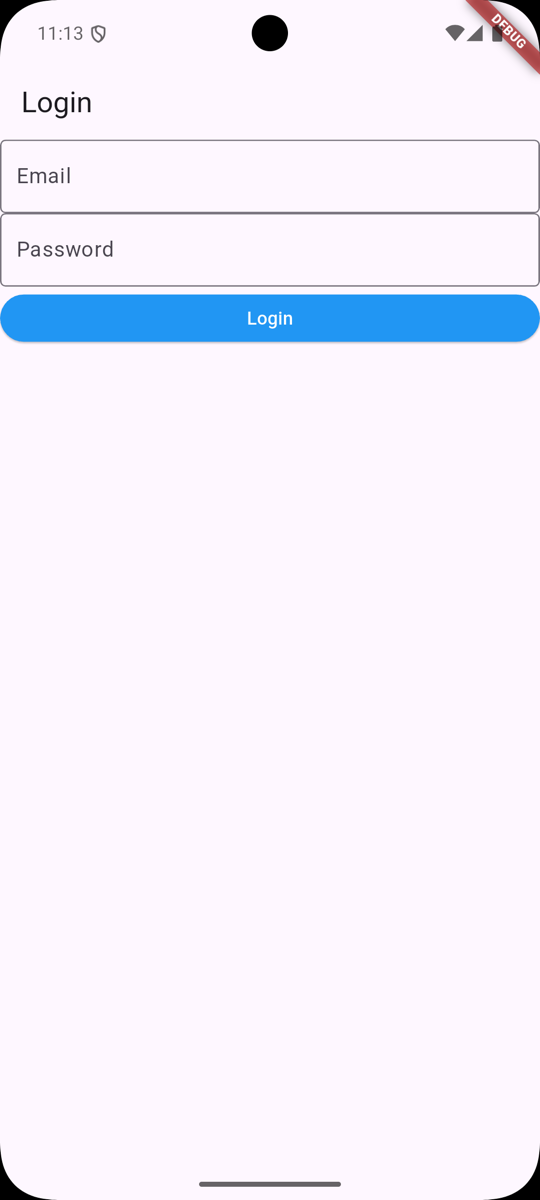
import 'package:flutter/material.dart'; void main() { runApp(MyApp());} class MyApp extends StatelessWidget { const MyApp({super.key}); @override Widget build(BuildContext context) { return MaterialApp( title: 'Welcome to Flutter', home: Scaffold( appBar: AppBar( title: Text('Login'), ), body: Column( children: <Widget>[ TextField( keyboardType: TextInputType.emailAddress, decoration: InputDecoration( border: OutlineInputBorder(), labelText: 'Email', ), ), TextField( keyboardType: TextInputType.visiblePassword, decoration: InputDecoration( border: OutlineInputBorder(), labelText: 'Password', ), ), ElevatedButton( onPressed: () { print('Login button pressed'); }, child: Text('Login'), style: ElevatedButton.styleFrom( backgroundColor: Colors.blue, foregroundColor: Colors.white, minimumSize: Size(double.infinity, 36), ), ), ], ))); }}Saving the file should automatically update the emulator with the new form:
But how did we get here?
We replaced our AppBar title with Login to reflect the purpose of the screen. Then, we used a Column component that accepted a list of children. In this case, we have three children:
-
TextFieldfor email input -
TextFieldfor password input -
ElevatedButtonfor login button
Let's break down each of these components.
Email Input
We are setting the keyboard type to emailAddress for our Email input to ensure that our Keyboard is optimized. We are also setting the decoration to include a border and label text.
TextField( keyboardType: TextInputType.emailAddress, decoration: InputDecoration( border: OutlineInputBorder(), labelText: 'Email', ),),This results in our Keyboard looking like this:

Look closely next to the ?123 - we have the @ symbol, a quick way to enter an email address.
Typically, the Keyboard would look like this:

This small optimization makes it easier for the user to enter their email address.
Password Input
Our password input has the same decoration as our email input, but the keyboardType is set to visiblePassword:
TextField( keyboardType: TextInputType.visiblePassword, decoration: InputDecoration( border: OutlineInputBorder(), labelText: 'Password', ),),This will ensure the password is visible as the user types it in. Of course, this can be changed to hide the password.
Login Button
Last, we need a button to submit the form. We are using the ElevatedButton component, which has an onPressed event that will be triggered when the button is pressed.
ElevatedButton( onPressed: () { print('Login button pressed'); }, child: Text('Login'), style: ElevatedButton.styleFrom( backgroundColor: Colors.blue, foregroundColor: Colors.white, minimumSize: Size(double.infinity, 36), ),),The style property sets the background color, text color, and minimum size of the button. The minimumSize is set to Size(double.infinity, 36) to ensure that the button takes up the full width of the screen.
In the next lesson, we will style our Login page even more to make it look more appealing.
Check out the GitHub Commit for this lesson.
No comments yet…